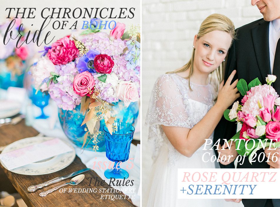
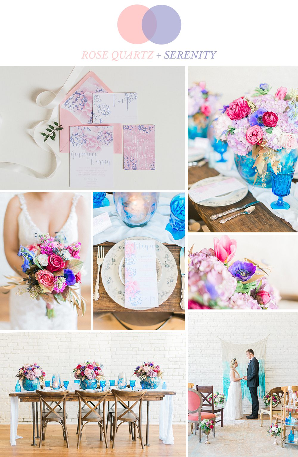
I dream in color. Color palettes, color combinations, and color mixing is my everything. So I await the Pantone color of the year announcement with anticipation (think of it like a mini Christmas for designers). Past couple of years have been rich, saturated colors, so it was a nice change for this year to go with something serene and ethereal. Oh, and did I forget to mention that this year, Pantone announced not one, but two colors of the year? Yep, the colors of 2016 are beautiful shades of pink and blue called Rose Quartz and Serenity. As soon as the colors were announced, I was approached by Rachel from Rachel Marie Photography to participate in a relaxed bohemian editorial inspired by a combination of these two colors. Who could say no to that?
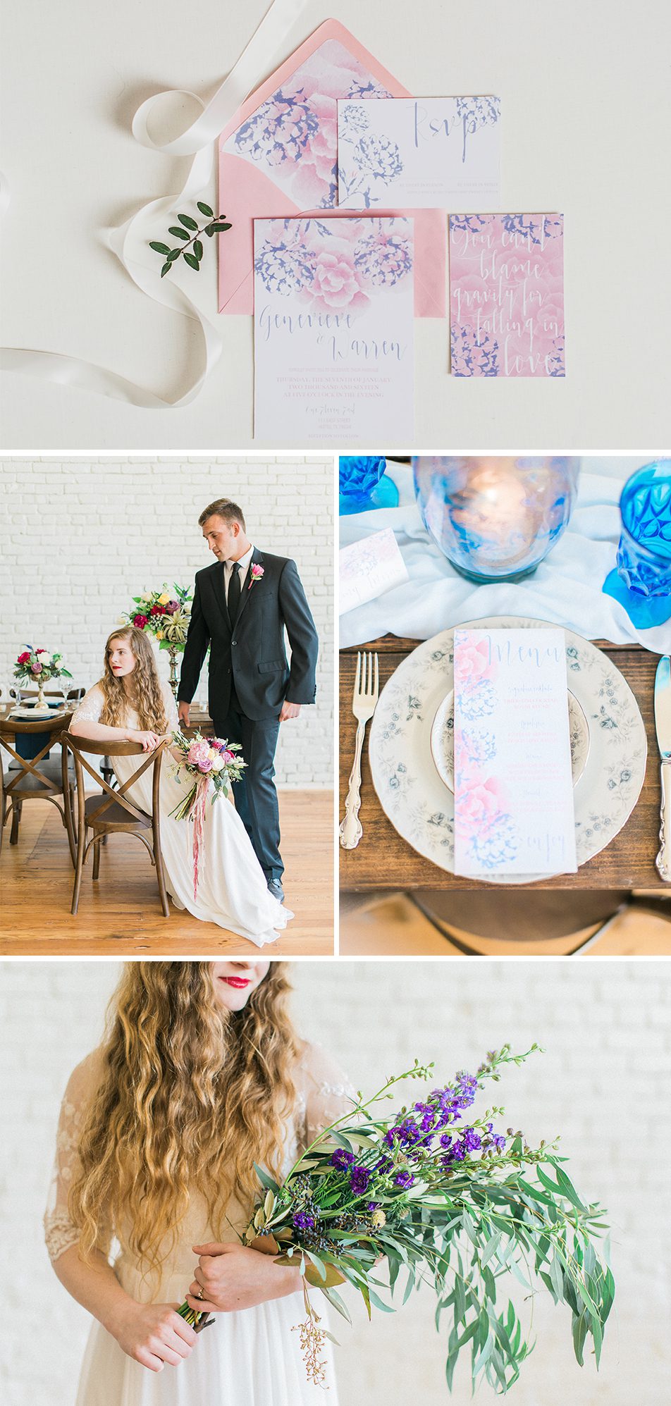
The shoot took place at One Eleven East, a beautiful, open and spacious venue in Hutto, Texas. Amanda Bee Floral created beautiful fresh flower arrangements and Birch and Brass Rentals supplied the pretty furniture and props. The brides wore gorgeous gowns from Saint Isabel Bridal. Lovely!
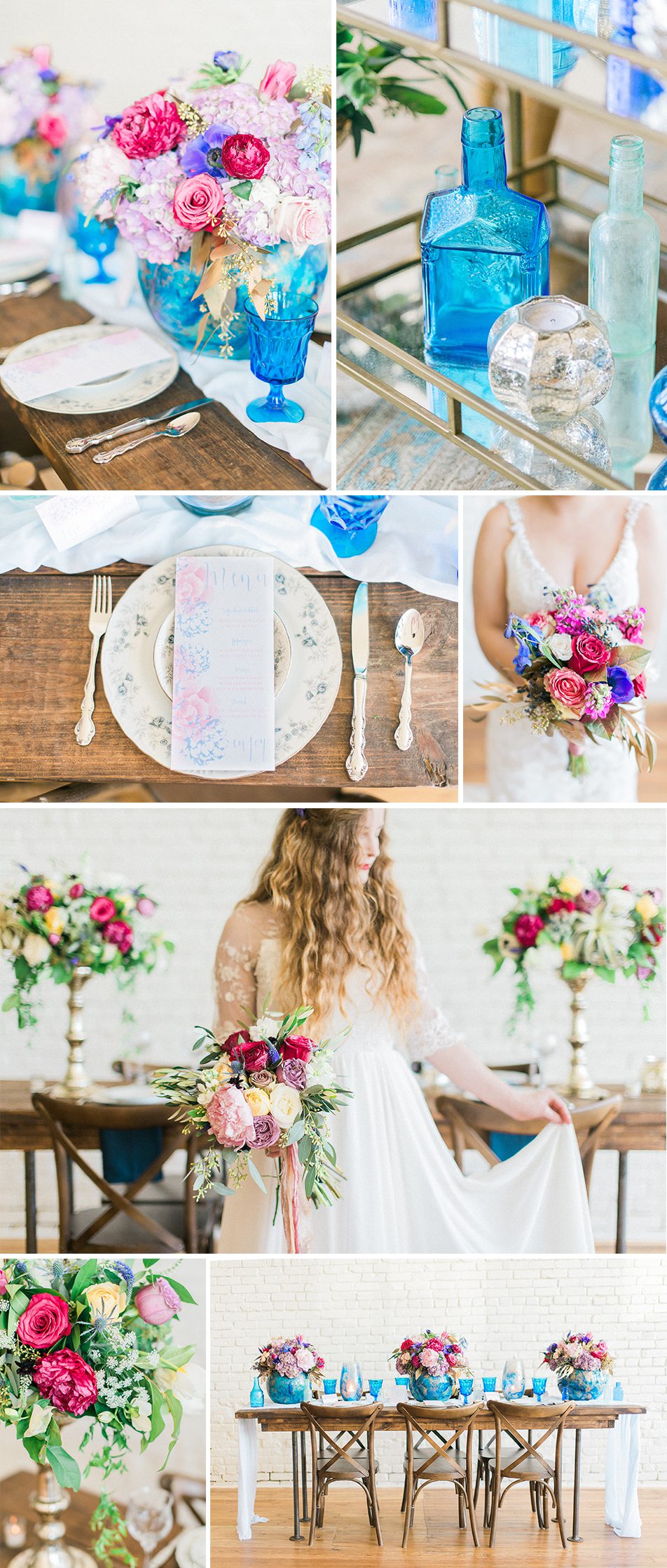
So many elements that I absolutely love- the colorful glassware, vintage touches, flowy bohemian gowns, and rustic furniture- the perfect elegant boho wedding!

Collaborators: Stationery: Bohemian Mint // Photography: Rachel Marie Photography // Dress: Saint Isabel Bridal // Rentals: Birch and Brass Rentals // Venue: One Eleven East // Flowers: Amanda Bee Floral
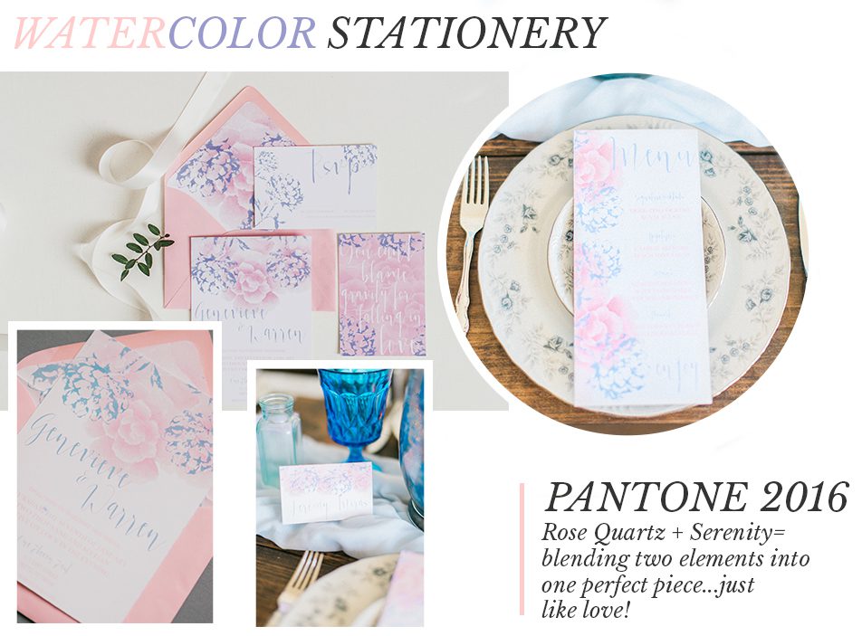
The wedding stationery was inspired by Pantone colors of the year and had a very soft and romantic vibe. I layered pink and blue watercolor flowers and added very whimsical calligraphy. The set was handpainted with watercolors and included a full invitation suite, menu cards, and place cards.
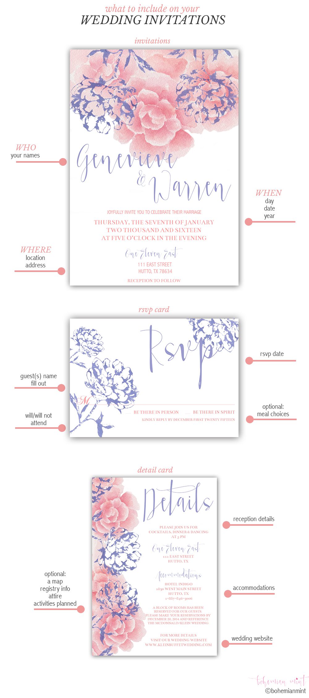
I get a lot of questions on what information is needed on wedding invitations. The simple answer is- there are no iron clad rules: over the past couple of years, the wording itself has become a lot more flexible and laid back. I am a huge fan of informal wording and adding a bit of personality, but at the same time- I like to keep it classy and simple. The most important thing for your guests is to easily find the following information: who is getting married, where and when (you can call it “3Ws“). Include a simple response card with a clearly marked deadline and a space for the guest(s) to write their name(s). If you are having a sit-down-meal with entree choices, you can have your guests mark it on there as well. An enclosure card is great to include the following information: reception venue, accommodations, registry information, wedding website, or any additional information you want to share about the wedding. I made a cute little infographic with a summary, so feel free to pin it for a future reference:
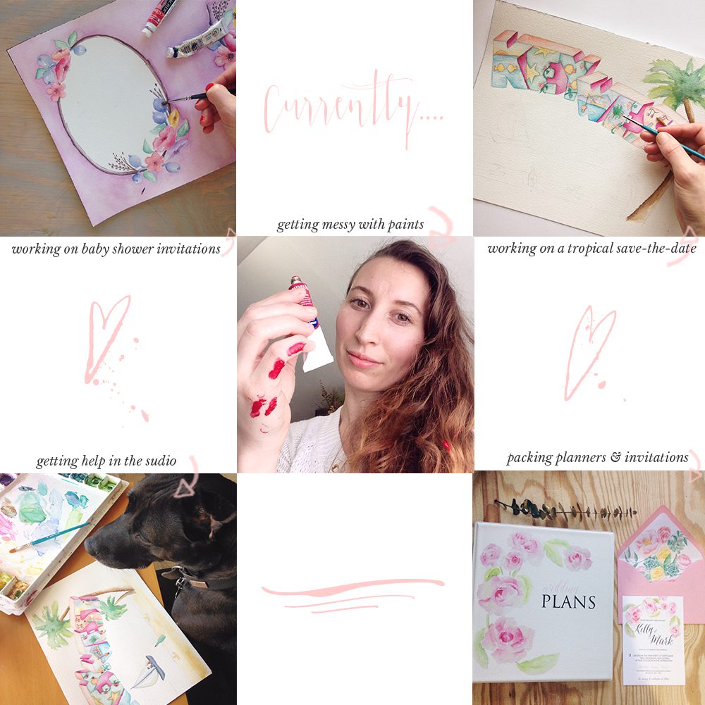
And lastly a bit of what has been going on lately at my studio. I am currently working on a bunch of client work, getting messy with paints and getting some major help in the studio from my four legged fur baby. To tell the truth, she is the real boss here. She is actually the one who mixes the paint and creates custom stationery for her clients. I just fetch her treats and run out to mail the orders. So now you know. 🙂
Thanks for reading! If you are interested in custom wedding invitations, please feel free to reach out at hello@marketafhorton.com. I specialize in handpainted watercolor invitations, so if you are a fan of art, watercolors, and whimsey, I’ll definitely be the person for you. And if you love tea and cake, chances are that we even become best friends.
Xx, Marketa


